The picture is balanced between the old man, child, and baby (where the emphasis is).
Contrast:
There is a contrast between the green plant and the bright red berries.
Repetition:

There are several Marilyn Monores in one design.
Variety:

All of the things in this picture are diverse and different. Therefore, it is not plain, there are several different things to look/focus at.
Emphasis:
In this design, the black dot is emphasized, because it stands out from all the others.
Proportion:

There is correct proportion, because her face and her body is the sized correctly. you wouldn't want her eyes to be bigger than her head, or her head smaller than her body.
Rhythm:

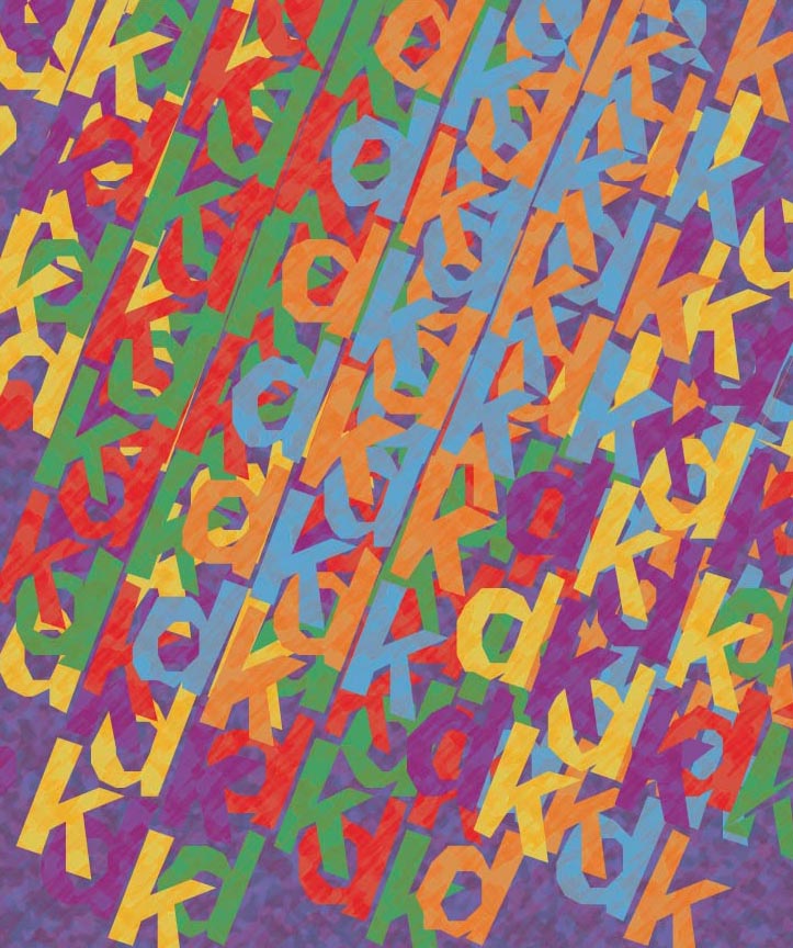
There is rhythm with all of the letters jumbled together.
Unity:

All of the hands work together to express 1 message.
How do you add a layer mask to a particular layer?
You click the add layer mask tool at the bottom of the layer pallet.
What two colors are used to create the mask?
black and white
Describe the process of using a layer mask?
You use the black to "erase" some of the drawing.

No comments:
Post a Comment