Friday, December 16, 2011
Semester Review
Before I came into graphic design I knew a lot about computers but nothing about photoshop and illustrator. We have learned things from work ethics to how to photoshop yourself into a picture. Next semester I hope to learn more and to improve with the things I learned this semester.
Review Week 17
I learned that the 2 main types of serifs are called Andante and Abrupt. In them are many different categories. I also learned the stone carvers started using serifs, and they are traced back to Rome.
Friday, December 2, 2011
Review Week 16
Of the seven classifications, which classification(s) would best work as body type? Why?
Blackletter because it resembles calligraphy
Blackletter because it resembles calligraphy
Identify the lowercase characters that have ascenders?
b, d, and h
b, d, and h
Identify the lowercase characters that have descenders?
p and q
Classify the following typefaces and briefly explain why you believe it should be classified that way:
 Serif: It has serifs
 Script: It was used formally
 Tecrative: specific purpose
 San Serif: there are no serifs
 Slab serif: It is thick
  Roman: It is very traditional looking with serifs
p and q
Classify the following typefaces and briefly explain why you believe it should be classified that way:
 Serif: It has serifs
 Script: It was used formally
 Tecrative: specific purpose
 San Serif: there are no serifs
 Slab serif: It is thick
  Roman: It is very traditional looking with serifs
Tuesday, November 29, 2011
Typography
Define typography?
the art of expressing ideas through the selectioin appropriate typefaces
Where did the word "typography" originate from?
form and writing
What does typography involve?
appropriate font, line spacing, and spacing between letters
What is a typeface?
distinctive designs of visual symbols that are used to compose a printed image/design
What is another term for typeface?
fonts
What is a character?
individual characters that make up a typeface
What is type style?
letters, numerals, and pronunciation marks
What does type style "create" within a design?
modifications in a typeface that create design variety while maintaining the visual style of the typeface
What is the waist line and what does it indicate?
imaginary line drawn at the middle of the characters
What is a base line and what does it indicate?
imaginary line drawn at the bottom of the characters
What is an ascender?
the part of the character that extends above the waist line
What is a descender?
the part of the character that extends below that base line
Describe a serif?
smaller lines used to finish off a main stroke of a letter, usually at the top and bottom of a character
How can the size of the typeface be identified?
point size--> it measures from the top of the ascender to the bottom of the descender
What is a point?
he vertical measurement used to identify the size of a typeface
How many points are in an inch?
72
What is a pica and how many are in an inch?
first size used/ 12
How many points are in a pica?
6
What is body type and where can it be found?
type sizes that range from 4 pt through 12 pt type
What is the key to selecting appropriate typefaces to be used as body type?
these sizes are found in places where there is a lot of text to be read/ readability
What is display type and how is it used?
types above 12 pt/ used to draw attention to a message
What is reverse type and when would it be used?
white type on a solid black or darker color background/ if the text is too small, reverse tye can be difficult on the readers eye.
What is a typeface classification?
a basic system for classifying typefaces was devised in the 19th century when printers sought to identify a heritage for their own craft
When was Blackletter invented and how was it used?
mid 1400's/ used with the inventions of the printing press
Describer the characteristics of a Blackletter typeface?
resembles calligraphy; high ornamental with elaborate thick and thin strokes
When was Old Style invneted and what was is based on?
15th and 16th centuries/ ancient Roman inscriptions and created to replace Blackletter typefaces
Describe the characteristics of an Old Style typeface?
wedge-shaped, thicker in the middle, not as crazy as blackletter, and has serifs
When were formal scripts developed?
17th and 18th century
When were casual scripts developed?
20th century
Describe the characteristics of a Script typeface?
based in forms made with flexible brushes or pens and have varied strokes reminiscent of handriting
When was Modern typefaces developed and why?
late 18th and 19th centuries/ developed as a radical break from traditional typography of the time
Describe the characteristics of a Modern typeface?
sharp contrast between thick and thin strokes and have thin, flat serifs
How early can Sans Serif typefaces be found? What happened?
20th century/ Italian Renaissance return to Old Style made the Sans Serif classification obsolete
When did they become popular?
1920's
What does "sans serif" mean?
without serifs
Describe the characteristics of a Sans Serif typeface?
its strokes are uniform in weight and have a monotone appearance
When was Slab Serif developed and why?
19th century/for advertising purposes
Describe the characteristics of a Slab Serif typeface?
mainly used for decorative purposes and headlines/ serifs are thick
Describe Decorative typefaces?
uniform line weight and thicker, square serifs
Why were they developed?
for a specific purpose , or theme, in mind
What are they best used for?
larger point sizes, or display type
Friday, November 18, 2011
Review Week 14
Academy of Art University
San Francisco, California
Master of Fine Arts. Bachelor of Fine Arts. Associate in arts. Certificate, Continuing education
AA, BFA, BA and portfolio development programs-high school diploma or equivalent
Art Institute of Pittsburgh
Pittsburgh, PA
Associate of Science in Graphic Design, Associate of Science in Web Design & Interactive Media, Associates in Photography, Bachelor of Science in Advertising, Bachelor of Science in Game Art & Design
High School diploma
Full Sail
Winter Park, Florida
Computer Animation - OnlineDigital Arts and Design, Computer Animation, FilmGame ArtGame Art - Online, Game DesignGame Design - Online, Game Development, Graphic Design - Online, Media Design - Online, Recording Arts, Show Production, Web Design & Development - Online, Web Design and Development
Portfolio, High School Diploma
Intentional Academy of Design and Technology
Nashville, Tennessee
Graphic Design
AA, BFA, BA and portfolio
Vancouver Film School
Vancouver
Digital Design
High School Diploma
What is a portfolio?
somewhere that you keep your work
What is the importance of a portfolio?
Since you store all your work there, you can always go back and view it for references.
Friday, November 11, 2011
Review Week 13
Balance:

The picture is balanced between the old man, child, and baby (where the emphasis is).
Contrast:
There is a contrast between the green plant and the bright red berries.
Repetition:

There are several Marilyn Monores in one design.
Variety:
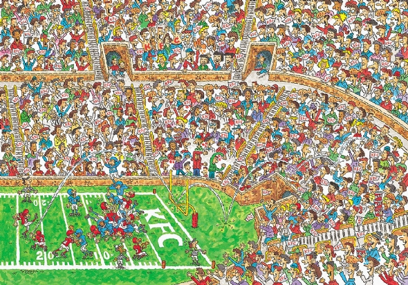
All of the things in this picture are diverse and different. Therefore, it is not plain, there are several different things to look/focus at.
Emphasis:
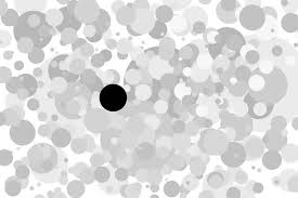
In this design, the black dot is emphasized, because it stands out from all the others.
Proportion:

There is correct proportion, because her face and her body is the sized correctly. you wouldn't want her eyes to be bigger than her head, or her head smaller than her body.
Rhythm:
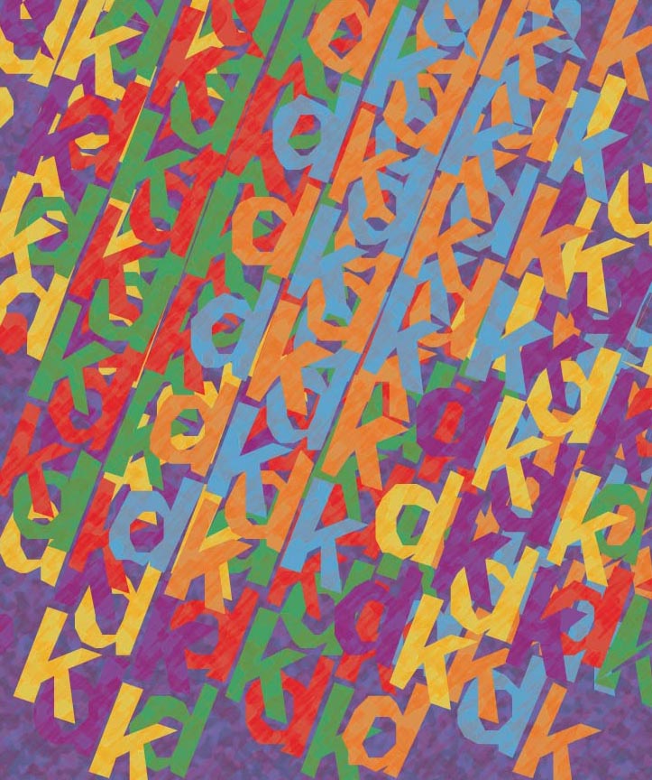
There is rhythm with all of the letters jumbled together.
Unity:

All of the hands work together to express 1 message.
How do you add a layer mask to a particular layer?
You click the add layer mask tool at the bottom of the layer pallet.
What two colors are used to create the mask?
black and white
Describe the process of using a layer mask?
You use the black to "erase" some of the drawing.
The picture is balanced between the old man, child, and baby (where the emphasis is).
Contrast:
There is a contrast between the green plant and the bright red berries.
Repetition:

There are several Marilyn Monores in one design.
Variety:

All of the things in this picture are diverse and different. Therefore, it is not plain, there are several different things to look/focus at.
Emphasis:
In this design, the black dot is emphasized, because it stands out from all the others.
Proportion:

There is correct proportion, because her face and her body is the sized correctly. you wouldn't want her eyes to be bigger than her head, or her head smaller than her body.
Rhythm:

There is rhythm with all of the letters jumbled together.
Unity:

All of the hands work together to express 1 message.
How do you add a layer mask to a particular layer?
You click the add layer mask tool at the bottom of the layer pallet.
What two colors are used to create the mask?
black and white
Describe the process of using a layer mask?
You use the black to "erase" some of the drawing.
Monday, November 7, 2011
Stephen Kroninger
What kind of art/design does he produce?
cuts photographic images to create a collage
In what publications/media studios has his work been featured?
the Museum of Modern Art and Whitney Museum of American Art
Post 2 samples of his art. Answer the following questions for each piece...
Was this piece published? Where?
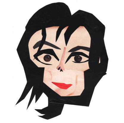
 What principles of design were utilized within the piece? How?MJ: Balance of his facial features and contrast between his lips and face.
Girl: Balance of her facial features and variety of different things in nature.
What elements of design were utilized?
MJ: Space to show what his face looked like and value from his face to his hair.
Girl: Use of texture to make the body parts stand out and use of color to make things pop out.
cuts photographic images to create a collage
In what publications/media studios has his work been featured?
the Museum of Modern Art and Whitney Museum of American Art
Post 2 samples of his art. Answer the following questions for each piece...
Was this piece published? Where?
 What principles of design were utilized within the piece? How?MJ: Balance of his facial features and contrast between his lips and face.
Girl: Balance of her facial features and variety of different things in nature.
What elements of design were utilized?
MJ: Space to show what his face looked like and value from his face to his hair.
Girl: Use of texture to make the body parts stand out and use of color to make things pop out.
Review Week 12
How can you, as the designer, use principles of design to help compose a page?
You can use them to make your page more interesting and draw the viewers into the page.
What are the principles of design (define each in your own words)?
Repetition- objects in the design more than once
Portion/scale- the size of different objects
balance- where the objects are on the page/design
emphasis- the things that are supposed to stand out
unity- the objects working together as a whole
variety- all the different objects used in the design
rhythm-organized movement throughout the page/design
contrast- 2 similar things differing from each other
Wednesday, November 2, 2011
Podcast #3 Principles of Design
Define principles of design?
concepts used to arrange the structural elements of a composition What do the principles of design affect?expressive content of the work
What is the principle of repetition?
repeating some aspect or element if the design throughout the entire document
Describe ways that the principle of repetition helps the composition/audience?
-acts as a visual key that ties the piece together
-controls the reader's eye and helps keep the attention
What are ways that you can incorporate repetition into your designs?-patterns, bold font, thick lines
What should you avoid when working with repetition?
dont repeat too much
What is the principle of proportion/scale?
the relative size and scale of various elements in a design
What is the most universal standard of measure when judging size?
the human body
How can the principle of proportion/scale be used as an attention getter?
unusual or unexpected scale
What is the principle of balance?
the distribution of heavy and light elements on the page
Which kinds of elements/shapes visually weigh heavier/greater?
larger elements
What is another name for symmetrical balance?
formal balance
Define symmetrical balance?
when the weight of a composition is evenly around a central vertical or horizontal axis
What is another name for asymmetrical balance?
informal balance
Define asymmetrical balance?
the weight of a composition is not evenly distributed around the axis
What is the principle of emphasis?
stressig of a particular are of focus rather than the maze of equal importance
What happens to a design that has no focus?
nothing stands out
What is a focal point and how is it created?
area where the eye tends to go to first/ making an element dominant with all other areas contributing but subordinate
How many components of a composition can be a focal point?
1
What ways can emphasis be created in a design?largest, brightest, darkest, or most complex
What is the principle of unity?
the wholeness of the composition
What three ways can unity be obtained?
1.Put objects close to each other
2.Make things similar
3.Direct vision by a line that travels around a design
What is the principle of variety?
differences and diversity
What ways can a designer add variety to a design?
texture, color, and shapes
Why is it important to find the right balance between unity and variety?
to have a successful and effective design
What is figure?
a form, silhouette, or a shape
What is another name for figure?
positive space
What is ground?
the surrounding area
What is another name for ground?
negative space
When a composition is abstract (has no recognizable subject) what will the figure depend on? What does that mean?
abstract relationship between the visual elements/ how they work together
Why must a designer consider the composition as a whole?
it is a mistake to only plan the figure
What is the principle of rhythm?
continuity, reassurance, or organized movement in pace and time
How is rhythm achieved?the orderly repetition of any element, line, shape, value (tone), texture
What three ways can rhythm occur in a design?
1.intervals between elements
2.more organic flowers
3.sequence of shapes
How does rhythm help a composition/design?
deliver the message/ also adds life
What is the principle of contrast?
occurs when 2 related elements are different
How can contrast help a design?
can draw the viewers eye into the piece
What is wrong with having too much or too little contrast in a design?
too little- becomes monotonous/ too much- can be confusing What is the key to working with contrast?
make sure the differences are obvious
What are some common ways of creating contrast?
size, value, color, type, texture, shape, alignment, direction, and movement
Monday, October 24, 2011
Friday, October 21, 2011
Andy Warhol
Within what art genre did Warhol work?
Pop art
Define the genre?
an art movement that began in the U.S. in the 1950s and reachedits peak of activity in the 1960s, chose as its subject matter the anonymous, everyday, standardized, and banal iconography inAmerican life, as comic strips, billboards, commercial products,and celebrity images, and dealt with them typically in such forms as outsize commercially smooth paintings, mechanically reproduced silkscreens, large-scale facsimiles, and soft sculptures.
an art movement that began in the U.S. in the 1950s and reachedits peak of activity in the 1960s, chose as its subject matter the anonymous, everyday, standardized, and banal iconography inAmerican life, as comic strips, billboards, commercial products,and celebrity images, and dealt with them typically in such forms as outsize commercially smooth paintings, mechanically reproduced silkscreens, large-scale facsimiles, and soft sculptures.
dictionary.com
During what years was he alive?
1928-1927
Post 2 samples of his art. Answer the following questions for each piece.
Campbell's Soup
He uses read, whites, and golds.
He does not use and particular color scheme.
This piece of work looks very old fashioned and straight to the point.
Marilyn Monroe
He used the bright yellow color for the hair different blues. He could have used the split complementary color scheme, or the triadic color scheme.
This work is well know, and it is very bright and outspoken.
Title of the piece?
Describe the color that he utilizes. Does he use any particular color scheme?
What do you notice about the artwork itself?
Color Schemes

Triadic color scheme

Analogous color scheme

Monochromatic color scheme

Warm colors

Split complementary color scheme
Friday, October 14, 2011
Review Week 9
Compare and contrast vector graphics and pixel images.Pixel images are broken into small squares that together make an image. Vector graphics are lines, curves, and shapes that together make a picture. they both create an image.
What resolution is necessary to print raster images?
300 DPI
What resolution is necessary to display raster images on the internet?
72 DPI
What resolution is necessary to print raster images?
300 DPI
What resolution is necessary to display raster images on the internet?
72 DPI
Friday, October 7, 2011
"Steve Jobs"
Who is Steve Jobs?
Chairman and CEO of Apple Inc.
Chairman and CEO of Apple Inc.
What company was he CEO for many years?
Apple
Apple
What did he do for the computer industry?
He helped invent new and improved technology that everyone could use for many different things.
He helped invent new and improved technology that everyone could use for many different things.
How did this man impact the graphic design industry?
He invented new things that could be used throughout the industry to accomplish the work
Review Week 8
Why must designers pay close attention to how color is utilized within a composition?
It impacts all visual communications
It impacts all visual communications
Why is the color wheel an important tool for graphic designers?
It shows the relationships between different colors
Find an example of neutral colors utilized within a design (hint: google poster design). Near the sample, discuss why you feel the designer included neutral colors within the composition.
The neutral colors are used to show relaxation.
Briefly describe how we "see" the color of an object?
We can see them when they absorb and reflect the colors of the visible light spectrum
Subscribe to:
Posts (Atom)

